Interaction Design for a Multi-User Collaborative Editor
by David Bacisin, published
My client’s product includes a cloud-based word processor for creating complex
financial documents. The documents are divided into separate sections which can be edited
simulateously, but only one person at a time can check out a particular
section for editing. If another person tries to open a section that someone already has open,
they would receive the message that The requested document, Note 1, is being edited by David.
Once finished editing, the person then checks in the section so that others may
access it.
After trying the software myself and observing support tickets, I noticed that many people struggled with the check-in process. While it was easy to check out a section by clicking the item to open it, a specific sequence of button clicks was needed to check in the section. Though some users were in the habit of following this sequence, every so often someone would leave a section incorrectly. When they later attempted to open a different section (perhaps the next day), they received the following error message:
You have multiple documents checked out already: MD&A. Please contact support for help in unlocking these documents.
My client usually received an email per week asking for help with unlocking documents, sometimes with the user frantically trying to meet a deadline.

Timeline for a typical case of incorrect check-in. Past emails indicated an average delay of 61 minutes for the support team to respond to a user struggling with locked documents. These situations not only confuse users and prevent them from performing basic tasks, but also take time away from the 3-person support team for resolving more complex issues.1
Data from Google Analytics indicated that, during a typical week of about 300 hours of use, users were seeing the error page 60 times per week, spending an average of 1 minute looking at the page. Clearly, the emails to support were not indicative of the true frequency, and the check-in sequence was not being followed as often as my client thought. Effectively, the user was being blamed—and suffering the consequences—for poor design.
The needs were twofold: a more intuitive check-in process as well as a way for people to resolve check-in problems quickly and by themselves.

After several rounds of revision, I developed a user flow for switching from one section to another—this would be the happy path, the sequence of actions under normal operating conditions.

Complex software doesn’t always operate under normal conditions, so I also designed a user flow for when the check-in process fails—due to a lost internet connection, for example.

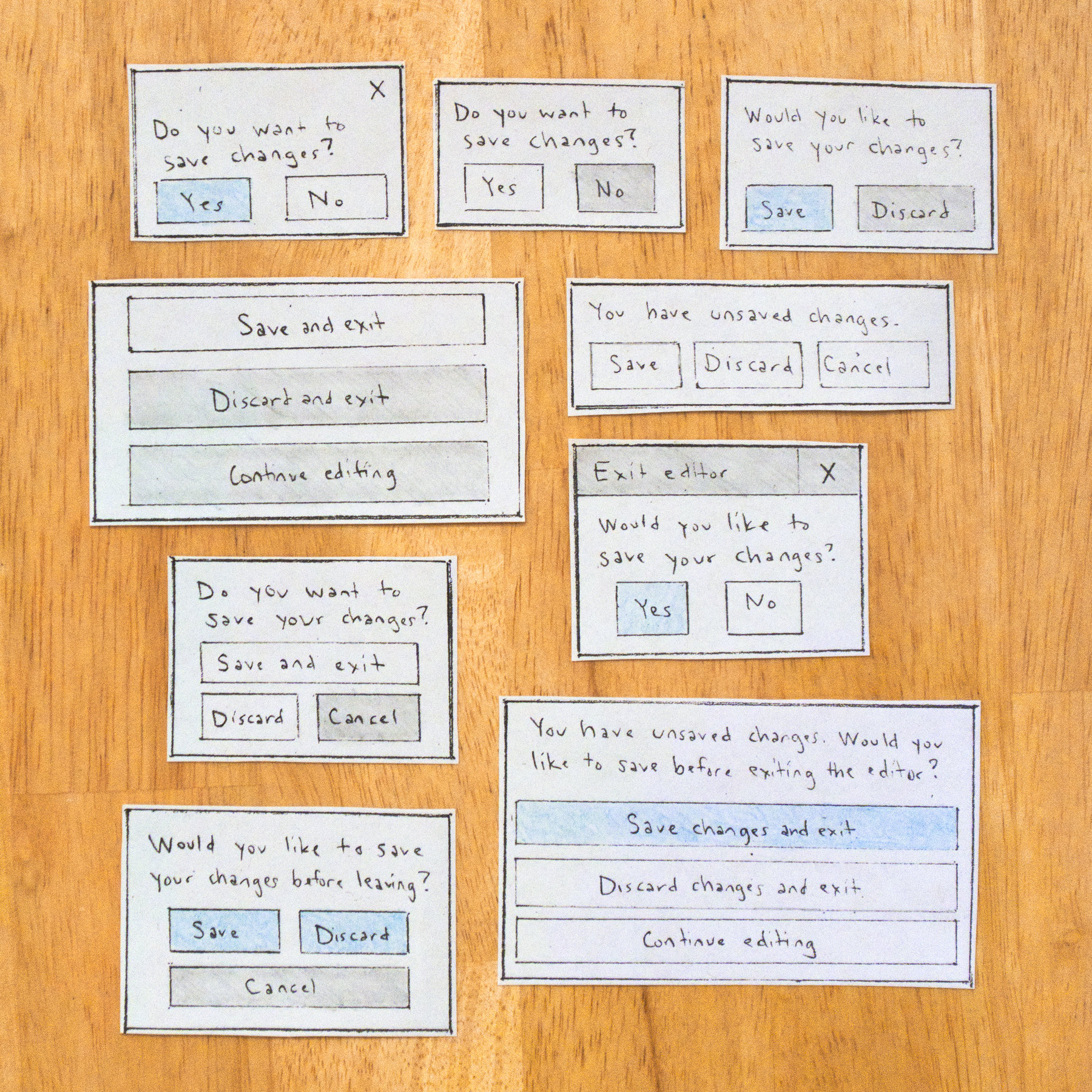
Since these changes, my client has seen a 28% reduction in emails to support for check-outs in general; moreover, 95% of the those remaining emails are for reasons that my client wants to be contacted about—that is, for problems the user is intentionally unable to resolve themselves. And while this has been a big win for support, users have remarked how they love the new three-button dialog when exiting the editor, not to mention the much easier transition from section to section.
Footnotes
-
Noto Color Emoji is an open source font project licensed under the SIL Open Font License, Version 1.1. ↩